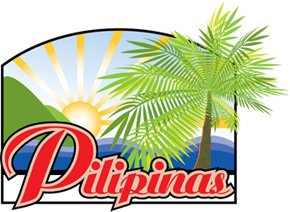
Pilipinas Philippine Portal Custom Logo Design
The natural beauty of the sun rising from the horizon inspires this custom logo forPilipinas.ph, an online portal about Philippine culture, travel and tourist attractions. Created on Adobe Illustrator CS2, the logo designer created the palm tree object from a single leaf then was given multiple instances, resized and twisted to create a fuller effect palm leaves. Three tones of green were used to show color depth for the leaves. A circle and widening lines were used to draw the sun and a yellow gradient for its color. To match the sun, a blue gradient was used for the sky to show perspective.
To adapt colors of the Philippine flag and to reflect the archipelago character of the Philippines, three shades of overlapping blue colors were used to symblozie the Philippine ocean. Two shades of green; the jade overlapping the little sprout green were used to depict the mountains.
A regular Ariston font was used for the Pilipinas word with the capital P thirty percent bigger than the other characters. The logo designer made three copies of the Pilipinas word each with three different colors, red, latte and black. Each of the colored words were resized one bigger than the other and placed on top of another to create a two toned stoke.
The whole view design was then enclosed inside a black square border with the top side arched. A white background for the Pilipinas word was then placed at the bottom. The word Pilipinas was placed on the white background but fifty percent bigger than the white background.
Logo Artist: Enrique Sevilla
Logo Art Director: Gerry Diwa
Logo graphic design software: Adobe Illustrator CS2
Go back to Logo Design Services »

Custom Logo Designs
- Pinoy Sports logo
- Pilipinas - Philippine logo
- Flash Logo for Bingo Games UK
- Flash Logo for Internet Poker List
- Logo for World Series Baseball
- Logo for Footy Football
- Logo for Wager Talk
- Logo for Horses Wild
- Logo for Casino Exit
- Logo for Blackjack Online Internet
- Logo for Roulette Lessons
- Logo for Baccarat Million
- Logo for NFL Betting Tips
Trapik Media Services
- Search Engine Optimization (SEO)
- Content Writing & Management
- Brand Positioning, Online Reputation Management (ORM)
- Internet marketing
- WordPress customization and theme design
- Consulting and Training Ask us anything about your company's Internet strategy, web site design and development.
- Training for software, SEO-writing and Link Building
- Website Design
- E-commerce OsCommerce site development
- Logo Graphic Design


